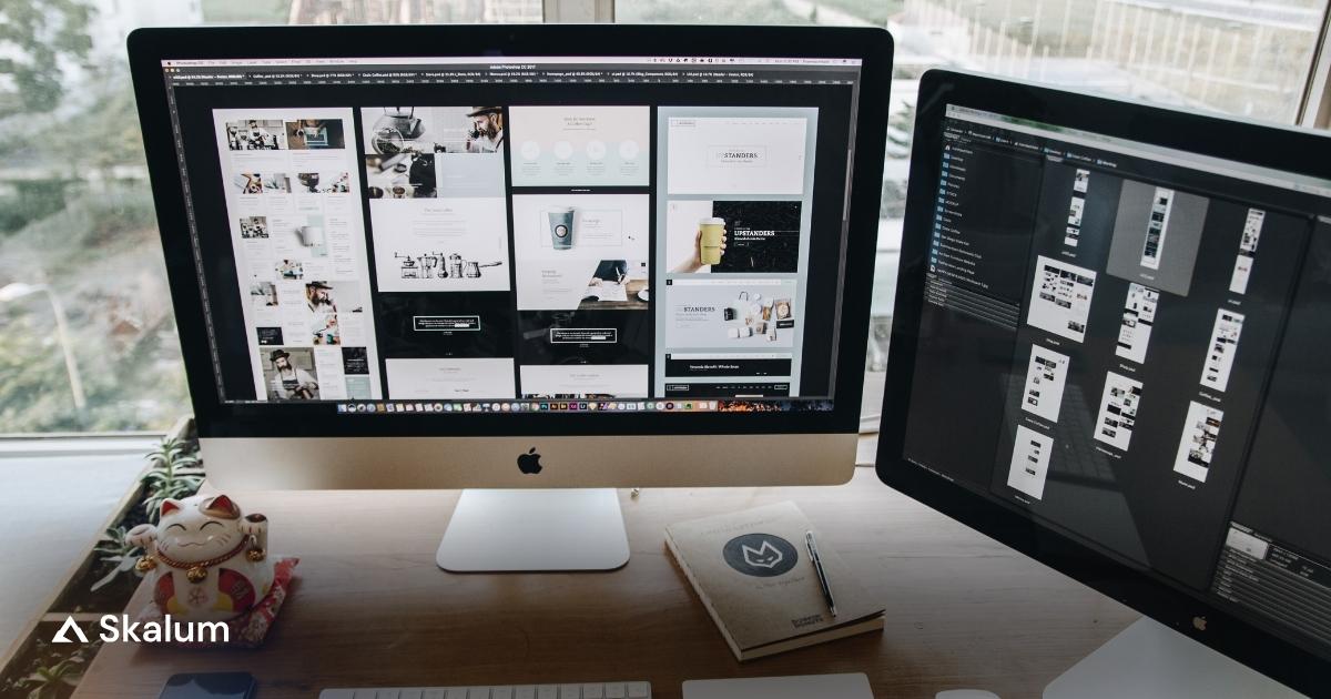
Product Page Design: 12 Fixes That Lift Add-to-Cart

⏱ 10 min read
A weak add-to-cart rate rarely means shoppers dislike the product. More often, your product page design makes them work too hard before the click.
That is the real job of a Shopify PDP: remove doubt fast, show the next step clearly, and keep the buying decision feeling simple. Good product page design does not chase decoration first. It makes the page easier to trust, easier to scan, and easier to act on.
Shopify Product Page Optimisation Starts with Clarity, Not Decoration
Add-to-cart rate matters because it tells you whether the page is doing its first job well. Checkout comes later. If people never click, the rest of the funnel is just an expensive theory.
That matters because product page design is still where many stores lose intent. Baymard’s product page research found that 51% of ecommerce sites have “mediocre” or worse product page implementations overall. That is not a small design problem. That is a revenue problem with decent padding and a trendy font.
Strong product page design does three things at once. It confirms relevance, reduces friction, and answers the questions that stop people hovering over the button like it owes them money.
- Relevance: the page matches the promise made in the ad, search result, collection page, or email click.
- Confidence: the shopper can judge value, trust, delivery, and fit without opening three extra tabs.
- Momentum: the page makes the next action obvious instead of burying it under blocks nobody asked for.
Product Page Design Above the Fold: 4 Elements That Decide the First Click
Element 1 — A Headline That Confirms What the Shopper Expected
Your headline should confirm the product, not audition for a branding award. Clear naming beats clever copy because the shopper wants reassurance first and personality second.
Element 2 — Price and Value Framing That Need No Interpretation
Price should sit where the eye expects it, near the title and the buy box. If there is a discount, show the comparison cleanly. If the value comes from a bundle, refill cadence, or subscription saving, explain that before the click, not after it.
Element 3 — A Primary Add-to-Cart Button That Looks Like the Next Step
The main CTA should dominate the action area. One button. One job. Wishlist, finance explainer, gift wrap, and “find in store” can exist, but none of them should compete visually with the button that actually moves the buyer forward.
Element 4 — Variant Selectors That Reduce Hesitation
Variant UX breaks more sales than many teams realise. A shopper should never wonder whether they picked the right size, colour, scent, or format. Good selectors feel obvious. Bad ones feel like admin.
- Use buttons or swatches when the number of variants is manageable.
- Update images, price, stock, and delivery cues when a variant changes.
- Keep unavailable variants visible but clearly marked instead of making them disappear without explanation.
Shopify Product Page Design Elements That Remove Buying Friction
Element 5 — Product Media That Answers Scale, Texture, and Use-Case Questions
More media is not the goal. Better media is. Good product page design uses media to answer questions before they become objections. Shoppers should be able to judge scale, texture, fit, and use case without guessing.
Element 6 — Delivery, Returns, and Payment Details Placed in the Decision Zone
Shoppers should not need to leave the buy box area to learn when the item arrives, how returns work, or whether they can pay by instalment. This information belongs near the CTA because that is where doubt peaks.
Delivery details are not minor admin. Baymard found that 64% of users looked for shipping costs on the product page before deciding whether to add an item to the cart. That is exactly why product page design should surface shipping, returns, and payment options near the CTA. See Baymard’s research on showing shipping costs on product pages.
Element 7 — Trust Signals That Support the CTA Instead of Hiding in the Footer
Reviews, ratings, guarantees, secure payment cues, and notable proof points work best near the point of decision. A strong product detail page Shopify setup earns trust by placing proof close to the click, not by hiding it three scrolls lower.
Element 8 — Stock and Urgency Cues That Guide Action Without Looking Desperate
Urgency works when it informs. “Only 4 left in this size” is useful. A countdown timer that resets every morning belongs in the same bucket as “limited edition” socks that somehow never run out.

Product Page Design for Mobile Shoppers Who Buy with One Thumb
Element 9 — Sticky Add-to-Cart for Long-Scroll Pages
On mobile, the CTA should not disappear the moment the shopper reads further. A sticky add-to-cart bar keeps the action available after the buyer has checked images, reviews, FAQs, or shipping terms.
Element 10 — Tap-Friendly Hierarchy, Spacing, and Accordions
On mobile, product page design has to respect thumb reach, limited attention, and shorter scanning patterns. Important sections need clear spacing, large tap targets, readable selectors, and accordions that reveal supporting information without hiding what actually drives the decision.
Performance matters here too. Google and Deloitte found that a 0.1-second improvement in mobile site speed increased retail conversions by 8% on average. You can see that in the Milliseconds Make Millions study. Speed and product page design should not be discussed in separate meetings as if one is technical and the other is commercial.
Not sure where to start? Skalum can help.
CRO Audit
Find where your product page loses intent before you spend money on another redesign.
Learn more →Theme Development
Fix variant logic, buy box structure, and theme friction without bloating your store.
Learn more →Website Redesign
Rebuild pages that look tidy in Figma but underperform where it matters.
Learn more →Shopify PDP Content That Answers Objections Before Checkout
Element 11 — Benefit-Led Copy Before Specifications
Feature lists matter, but not first. Lead with what the product solves, improves, or makes easier. Then support that with dimensions, materials, ingredients, technical specs, or compatibility details once the shopper already sees the value.
Element 12 — Reviews, FAQ, and Comparison Content That Close the Confidence Gap
Reviews are not decorative proof. PowerReviews reports that 98% of shoppers say reviews are an essential resource when making purchase decisions, and 45% will not buy if there are no reviews available. Strong product page design treats reviews and FAQ content as conversion assets, not filler. See the data in PowerReviews’ review survey.
A good FAQ block also saves the description from becoming a wall of text. The best product page design answers objections before checkout starts, not after the customer has already gone looking for reasons to delay.
How to Diagnose a Weak Shopify Product Page Before Redesigning It
Do not blame the button first. Check what shoppers do before they reach it. A proper CRO Audit usually shows whether the real problem sits in variant friction, price clarity, delivery anxiety, weak media, or poor mobile hierarchy.
Once you know the friction point, testing gets cheaper and faster. That is where CRO Optimisation Services earn their keep: not by guessing harder, but by reducing the number of expensive wrong ideas.
| What you see | Likely friction | Test first |
|---|---|---|
| Strong product-page traffic, weak add-to-cart rate | Mismatch between intent and buy-box clarity | Rewrite headline, price framing, and CTA hierarchy |
| People open reviews and shipping info before clicking | Trust and delivery details are too hidden | Move proof and delivery promises nearer the CTA |
| High variant interaction, low cart adds | Selector confusion or missing variant feedback | Test swatches, clearer labels, and variant-specific media |
| Mobile users scroll deep but do not act | CTA disappears or content order is wrong | Add sticky ATC and tighten mobile hierarchy |
- Watch session recordings to see where attention stalls.
- Use heatmaps to spot dead zones around the buy box.
- Run one focused test at a time instead of redesigning six things and learning nothing.
Shopify Product Page Template or Custom Product Page Shopify Build?
A shopify product page template is enough when your catalogue is simple, your variants are straightforward, and your biggest issue is content clarity rather than architecture. In that case, disciplined layout changes beat a full rebuild.
A custom product page Shopify build pays off when your PDP needs variant-specific content, richer bundles, subscription logic, compatibility guidance, or unique merchandising blocks. At that point, the theme has become part of the conversion problem, not just the visual wrapper.
If that is the case, a Shopify Theme Development Agency can fix structural theme issues without loading the page with yet another app. When the whole journey feels dated, not just the buy box, Website Redesign Services make more sense than endlessly patching a layout that stopped helping months ago.
The Fastest Way to Improve Product Page Design Without Rebuilding Everything
Good product page design is less about adding more blocks and more about removing the right doubts at the right moment. Start with the buy box, delivery clarity, variant logic, reviews, and mobile hierarchy before you touch anything decorative. Most stores do not need a dramatic rebuild. They need a sharper sequence. If your team cannot see where the friction starts, a CRO Audit is the fastest way to stop guessing.
Want help with this? Skalum can.
CRO Optimisation
Turn product-page insights into controlled tests that improve conversion, not just aesthetics.
Learn more →Theme Development
Fix structural PDP issues inside the theme instead of stacking more apps on top.
Learn more →Frequently Asked Questions
The top section should confirm the product, show the price, display the main media, and make the next action obvious. On a strong Shopify product page, the add-to-cart button, key variants, delivery summary, and basic trust cues all sit in the first decision zone rather than hiding further down.
Usually yes, especially on longer pages with reviews, FAQs, or detailed descriptions. A sticky CTA keeps the action visible while the shopper gathers confidence. It works best when paired with clear variant selection and pricing, not as a bandage for a weak Shopify PDP.
A Shopify PDP is the standard product detail page inside the store structure. A single product landing page usually gives one item a more campaign-led layout, often with stronger storytelling and fewer distractions. Both can convert well, but the right choice depends on traffic source, offer complexity, and buying intent.
A template is enough when your catalogue is simple, your variants are easy to understand, and your main issue is clarity rather than page architecture. If you only need better hierarchy, cleaner proof placement, and sharper copy, a good Shopify product page template can do the job without custom development.
Shopify product page customization pays off when the default layout cannot support how the product is sold. That includes bundle logic, subscriptions, rich variant content, compatibility blocks, or advanced merchandising. At that point, customisation stops being cosmetic and starts removing genuine conversion friction.
Start with one section at a time and protect the buying sequence. Move the headline, price, CTA, variants, trust cues, or delivery details only with a clear reason. The safest way to Shopify edit product page sections is to test controlled changes instead of rebuilding the whole layout at once.
The strongest signals are the ones closest to the buying decision: reviews, ratings, returns clarity, secure payment options, and realistic delivery promises. Social proof matters, but placement matters more. Even strong signals lose force when they sit too far from the add-to-cart zone.
Start with the buy box. Improve headline clarity, show delivery and returns sooner, tighten mobile hierarchy, strengthen product media, and simplify variant selection. Stores usually increase Shopify product page conversions faster by fixing the decision zone than by redesigning every visual detail around it.